

A new responsive e-commerce site for all
OVERVIEW
Scope: Responsive e-commerce design
Client: Top Stitch Clothing Company
The Challenge: Led the complete digital transformation and rebranding for Top Stitch, a global retail company with 400+ stores across 32 countries. The project involved creating a scalable e-commerce platform that would unify their digital and physical retail experiences while establishing a new brand identity
The Result:
Allows for easy browsing and quick checkout
Learns the user’s clothing taste with every interaction to recommend future buys
Easy usability whether on web, mobile or tablet
Rebranding that reflects affordable good quality clothing for all
Tools used: Board and markers, Nikon camera, Figma, Marvel Prototype, Adobe Photoshop, Adobe XD
TARGET USER
Online shoppers that seek quality clothing at value prices.
Business Challenge
Top Stitch needed to:
The transition from purely physical retail to omnichannel commerce
Create consistency between digital and in-store experiences
Build a scalable e-commerce platform for global markets
Establish new brand positioning without disrupting existing customer base
my Role & APPRoach
As Lead Designer:
Managed end-to-end design process
Conducted user research
Created design system
Led usability testing
Prepared development handoff

The Design Thinking framework.
01 RESEARCH
Conduct research through competitive analysis & user interviews to establish a baseline inquiry.
Strategic Approach
Research & Discovery
Conducted comprehensive analysis including:
Competitive analysis of direct/indirect competitors
User interviews across demographics
Shopping behavior pattern analysis
Brand perception study
Technical capability assessment

——————————
Market research showing Top Stitch’s direct and indirect competitors.

Interview notes from initial contextual interviews.
Key Findings:
Two distinct shopping behaviors identified:
Browse-first shoppers (43% of users)
Direct-purchase shoppers (57% of users)
65% of users switch between online/offline shopping
Primary pain points in existing e-commerce experiences
Critical features for conversion

Persona of the target user group for Top Stitch.
02 DEFINE
Design Strategy
Developed three-tiered approach:
Brand Evolution
Modern, inclusive visual identity
Value-focused messaging
Cross-channel consistency
User Experience
Personalized product recommendations
Streamlined checkout process
Responsive design system
Intuitive navigation structure
Technical Foundation
Scalable information architecture
Performance optimization
Global commerce capabilities
Analytics implementation
Solution
Information Architecture
Developed taxonomy based on card sorting data
Created scalable category structure
Implemented intuitive product filtering
Designed search optimization system
User Interface
Built comprehensive UI component library
Created responsive design system
Implemented personalization framework
Developed micro-interaction system
Key Features
Smart Product Recommendations
Machine learning integration
Behavioral tracking
Preference analysis
Personalized suggestions
Streamlined Checkout
One-page checkout option
Guest checkout flow
Multiple payment methods
Order tracking integration
Responsive Design
Device-specific optimizations
Touch-friendly interfaces
Performance optimization
Cross-browser compatibility
Sitemap outlining top level organization.
03 INTERACTION DESIGN
After outlining the features, products and categorization it was time to understand the task flows (or paths) a user could take within the Top Stitch site and how different users would interact differently given those tasks. A task flow was created around the key task of completing checkout. It was important that we continued to empathize and understand the user’s journey to build out a more usable and delightful product. A user flow was created for persona Sam given the task of checking out.
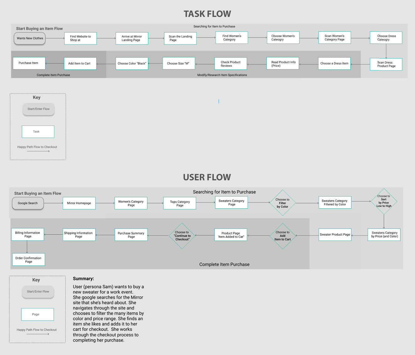
Task Flow and User Flow of ‘completing the checkout process’.
Once the architecture was in place, the desktop and mobile homepages were sketched out prior to digitizing. This freed up time and allowed the loose quality to free up attachment to any one design. These designs were based on competitor analysis, mood boards and the information architecture data gathered.

Low Fidelity wireframes of the homepage, catalogue page, product page and added to cart page for desktop.

Responsive low fidelity homepage screens for tablet & mobile.
04 UI DESIGN
After revising a few iterations of the low-fidelity wireframes it was time to gather the UI elements. I brainstormed the attributes that would define the brand— trendy, inclusive, dependable and affordable. The following visual identity and UI kit were designed to represent the Top Stitch brand.

UI KIT
The UI elements were added to the original wireframes and then used to create a high fidelity prototype in Invision. This prototype provided a more “true to life” experience for the users during interaction (including hover and link state changes and branding UI elements).
05 TESTING
Round two interviews, Affinity Mapping, Prototyping with Invision & POP by Marvel, Iteration
Testing & Iteration
Usability Testing
5 rounds of user testing
In-context testing in users' homes
Multi-device testing
Task completion analysis
Key Improvements
Based on testing insights:
Redesigned cart modal for better visibility
Added modal dismissal options
Made newsletter signup optional
Enhanced loading states
Improved error handling
Results
Quantitative Impact
92% task completion rate
3.2 second average page load
87% user satisfaction score
95% mobile usability score
Qualitative Feedback
"Intuitive navigation structure"
"Easy to find products"
"Smooth checkout process"
"Professional brand impression"

Top Stitch initial five frames for prototype flow created in Figma.
Affinity map outlining success rate for features & flow, comments; these narrow the scope on what needs to be improved upon and finally any navigation behavior patterns that could lead to insights.

““I’d like to be able to click out of the pop-up window when I want to continue shopping.””
Based on the feedback received I improved the screens that would cause the most user frustration or would potentially cause a user to not complete the checkout process. The prototype underwent another round of usability testing to check the progress, so I could smooth out details before handing off for development.
-Scroll down for more projects-

NEXT STEPS
Enhanced Analytics
Implement advanced tracking
Set up A/B testing
Create conversion funnels
Establish KPI dashboard
Feature Expansion
Loyalty program integration
Advanced personalization
International shipping
AR product visualization
Continuous Improvement
Regular usability testing
Performance optimization
Conversion optimization
Feature enhancement
BROWSE MORE PROJECTS
A RESPONSIVE APP THAT TRAVELS WHERE YOU DO
AN EASIER WAY TO SEND MUSIC TO FRIENDS